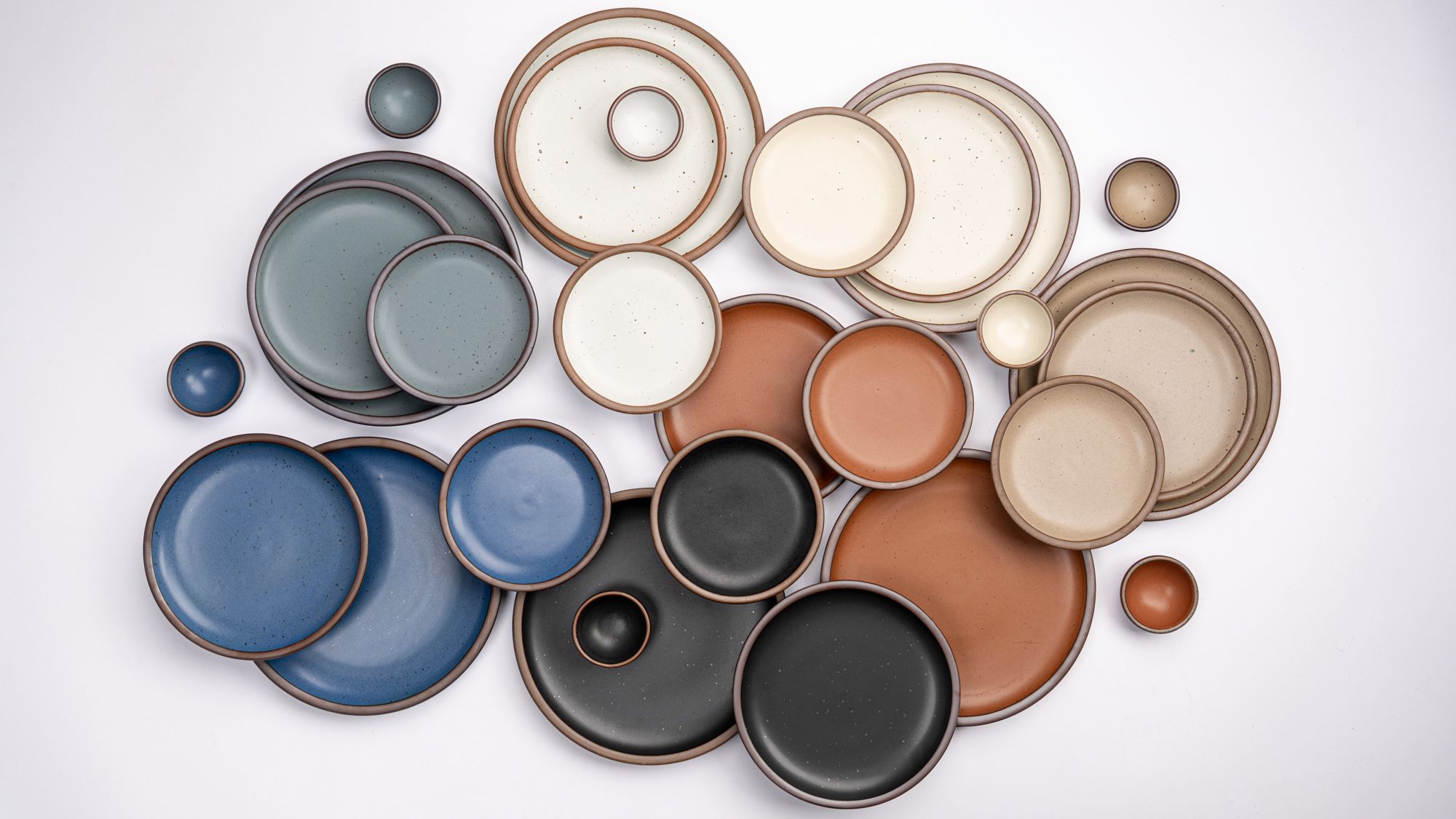
Color Theory: Core Colors
Our Core Glazes are a selection of neutral colors we offer year-round across all our forms, ranging from a cool, grayish white to a deep graphite black. These colors are the backbone of our collection—beautiful on their own or the perfect base to build on with the rainbow of seasonal shades we release throughout the year.
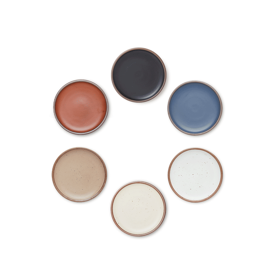
The seven core colors—Eggshell, Panna Cotta, Morel, Amaro, Black Mountain, Blue Ridge and Heron—strike a balance of light, dark, cool and warm tones. This neutral palette feels right at home just about anywhere, from an Appalachian log cabin to a Brooklyn apartment.
We chatted with the creative force behind our color stories, Head of Design Nicole Lissenden, about how the Core Palette came to be, what it takes to introduce a new color, and what might be on the horizon.
Can you tell us about the evolution of core?
The very first East Fork collection (before there were really cores and seasonals) consisted of Eggshell, Morel, Soapstone, Indigo and Ember. Indigo and Ember retired, and when I started at East Fork in 2018, our core consisted of Eggshell, Morel and Soapstone. All neutrals, all on the light side. Plenty of room for growth.
When we had the capacity to add more core colors in 2020, we took a look at what we could do in the immediate, and also looked further afield to a time we’d be able to have a 6 color core. We said goodbye to Soapstone, and we welcomed Amaro and Panna Cotta.
We decided that with the next core update, we wanted 6 colors that included 3 warms, 3 cools, 3 lights, 3 darks. It took another 2 years to arrive there, but with the addition of Blue Ridge and Black Mountain in 2022, we created a balanced, beautiful core palette.
In June 2025, with even more production capacity to support more colors in constant rotation, we added a seventh shade to our core. Heron, a mid-tone blue-gray, filled a gap for a cool, mid-range color to sit between light Eggshell and deep Blue Ridge and Black Mountain.
How does a color become a part of the core lineup?
First, we think about it for a really long time. Just speaking to the nature of the colors, they need to be timeless, grounded colors with broad appeal.
The production team has generated a lot of new capacity over the last few years, which has allowed us to increase the number of colors that can be produced simultaneously. We have lots of new equipment and a team of powerhouses, and that’s made it possible for us to maintain a larger core offering and maybe even continue to add!
How do you decide seasonals?
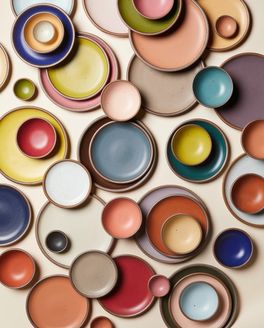
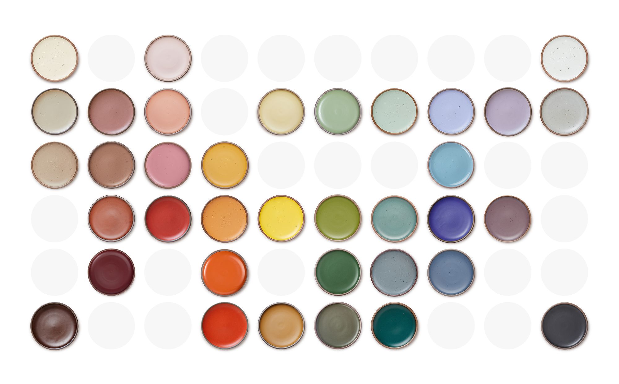
We’re getting to a point where we’ve developed a lot of seasonals. We plot every color we’ve ever done onto a chart more or less organized with rows going from light to dark as you go down, and columns going from warm neutrals, through the rainbow, and ending on cool neutrals. It helps us to visualize what we’ve done a lot of, and what is missing.
From there it’s a lot of daydreaming - gathering color notes out in the world, listening to our customers. A lot of times it comes down to gut instinct about what color is right for the moment. I then put together seasonal color proposals and go over them with our product team, and once we’re aligned on a direction we dive into development.
Also - some of our really amazing past seasonals came on at a time where a lot of our customers hadn’t yet found East Fork. Or maybe we did a very limited run of something and feel like it would perform well as a seasonal. Strategically bringing back past seasonals factors into the plans in a pretty big way.
Is it hard to come up with a new core color?
We want there to be something for everyone in our core palette. In an ideal world, there would be the perfect base color for each customer’s collection, that they can go all in on or use as a backdrop for their seasonal accents. As we work toward expanding, we think we need something else on the lighter side and a mid-range cool tone.
Our Product Team is working on drilling down what makes something a core color as we look toward expanding the offerings. I think we have a beautiful core now that will only improve as we increase capacity and continue to innovate. It’s a huge team effort!
How does color play into your job and day to day life?
One of my favorite things about this job is that just living in this world is a way to explore and evaluate color options. When I go on a hike, when I go shopping or walking around town, when I watch my kids mix paints - the color part of my brain is never off. I find it endlessly fascinating that we can only see part of the full color spectrum, and our idea of reality is tied to this falsehood. Alas, there are still plenty of visible-to-human colors left for East Fork to explore.
PSA: For other color lovers “I love Hue” is a really fun app to challenge your color vision.