Color Theory, Part II
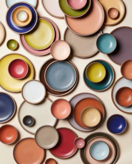
Welcome to East Fork’s playground of color! Our pots come in a grounded palette of core colors that are available year-round, but every year we like to release a handful of poppy, limited seasonal colors to infuse new energy into our collection.
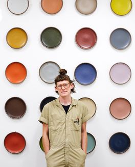
Sometimes our seasonal colors are entirely new formulations, and sometimes we pull past customer favorites from our archive, and Nicole Lissenden, our Head of Design, is the creative genius behind the magic of our color stories.
Nicole, everyone wants to know - how do you choose our seasonal colors? What was the inspiration behind the current seasonals, a sage green and a fiery orange?
It starts with assessing where we are, listening to our customers, really knowing and sitting with our color history, and evaluating how potential new colors will work within the East Fork color ecosystem. That gives me a sense of what to avoid and what to look out for. Then I just go out into the world with my color-eyes wide open, mostly looking to art and nature for inspiration. It’s a real color-first process–once they are locked in, the mood, third-party product assortment and creative direction follow.
I love looking at our customer’s rainbow pot collections, and those collections were really begging for a true orange! It had been a long time since we released Ember and not many people have it in their collections, so we decided to run in that direction.
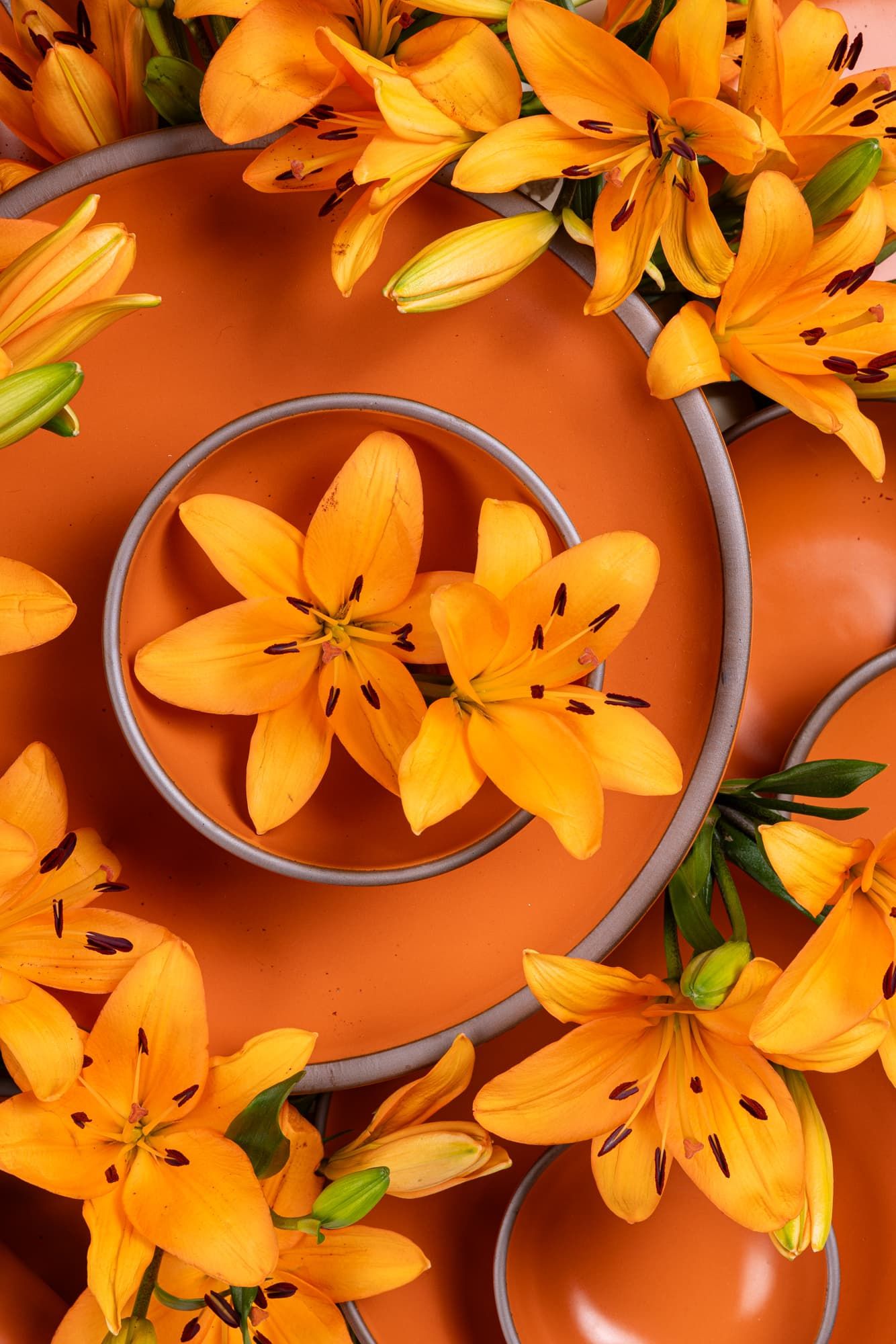
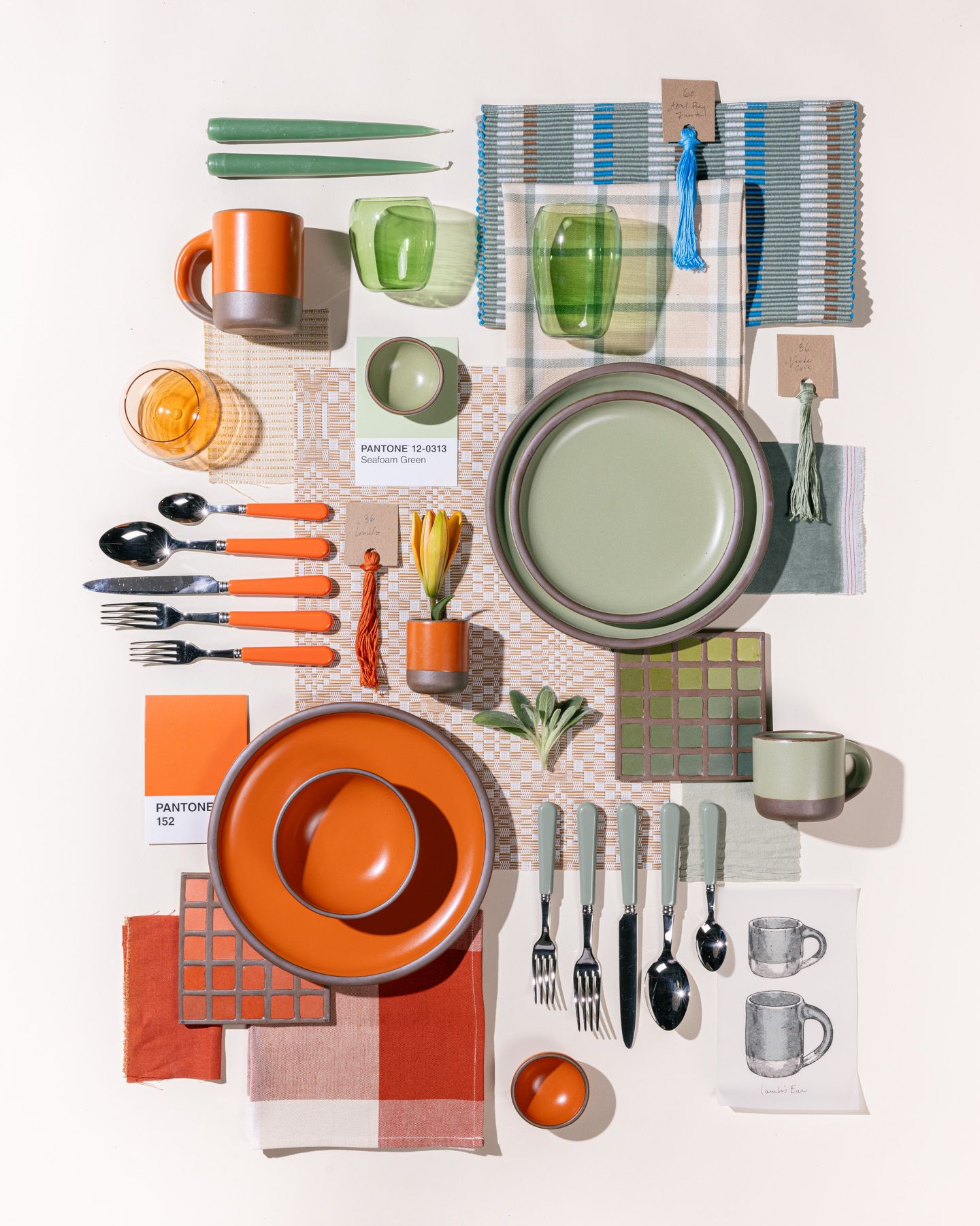
With Daylily feeling locked into place, we needed to hit a couple notes in the accompanying seasonals. One with broad appeal that could stand alongside Daylily, supporting it but also allowing it to take center stage. Then later, another that could stand as a bright, poppy color on its own.
I happened to be in DC last summer during the week we needed to hand off a direction to the materials team, and went to the portrait gallery with my husband, Alex (my secret weapon and best sounding board) with a mission to find that third seasonal color. Knowing what our other two colors would be, it felt like a puzzle with one right answer. I expected to find it in the art, but found it in the floor tiles. With that, we landed on this split-complementary palette of sorts with bright orange as the anchor.
A couple teasers of what the next year will bring that perhaps two people will be able to decipher: I had 3 best friends growing up and we were each born in a different season. We each had two colors, not necessarily our favorite colors but colors that represented us. Our spring friend was light blue and light green, our summer friend was royal blue and a poppy red, I’m the Fall baby but oddly enough I don’t remember mine.
Our winter friend’s colors are going to be East Fork’s fall/winter colors this year. Perhaps they’re not the most quintessential winter colors, but they’ve always felt like winter to me. And we just decided the direction for our Spring/Summer 2025 colors, which I found on a hike up Bearwallow mountain a month or so back.
So, all that to say, sometimes it starts in a practical place, but often starts in a more personal place with my own color memories, associations, and observations. I love seeing how our customers respond to them, how they fold them into their homes and lives, how they create palettes I would have never thought of. We’ll never please everyone, but it’s a real joy to watch what our colors spark in so many people and to have this outlet for my love of color.
What inspires you to bring a color back vs. start from scratch with a new color?
We bring concepts back on a regular basis, but because our clay and glaze base has been reformulated, on a practical level we’re starting from scratch each time.
It poses an interesting question: If we’re chasing a retired color, do we try to stay as true to that color as possible, or take that opportunity to improve upon it, even if it means a color shift?
For me, the answer is to chase the best possible color. We’re bringing back several retired colors this year and, while some customers may prefer we make an exact match, it’s A) not always possible considering material and process changes over the years and B) my feeling is that we’re artists, and we iterate. There may be a tool in our toolbox that wasn’t available to us when we first released it, and since we’re already reformulating, we’ll try to present the best version possible.
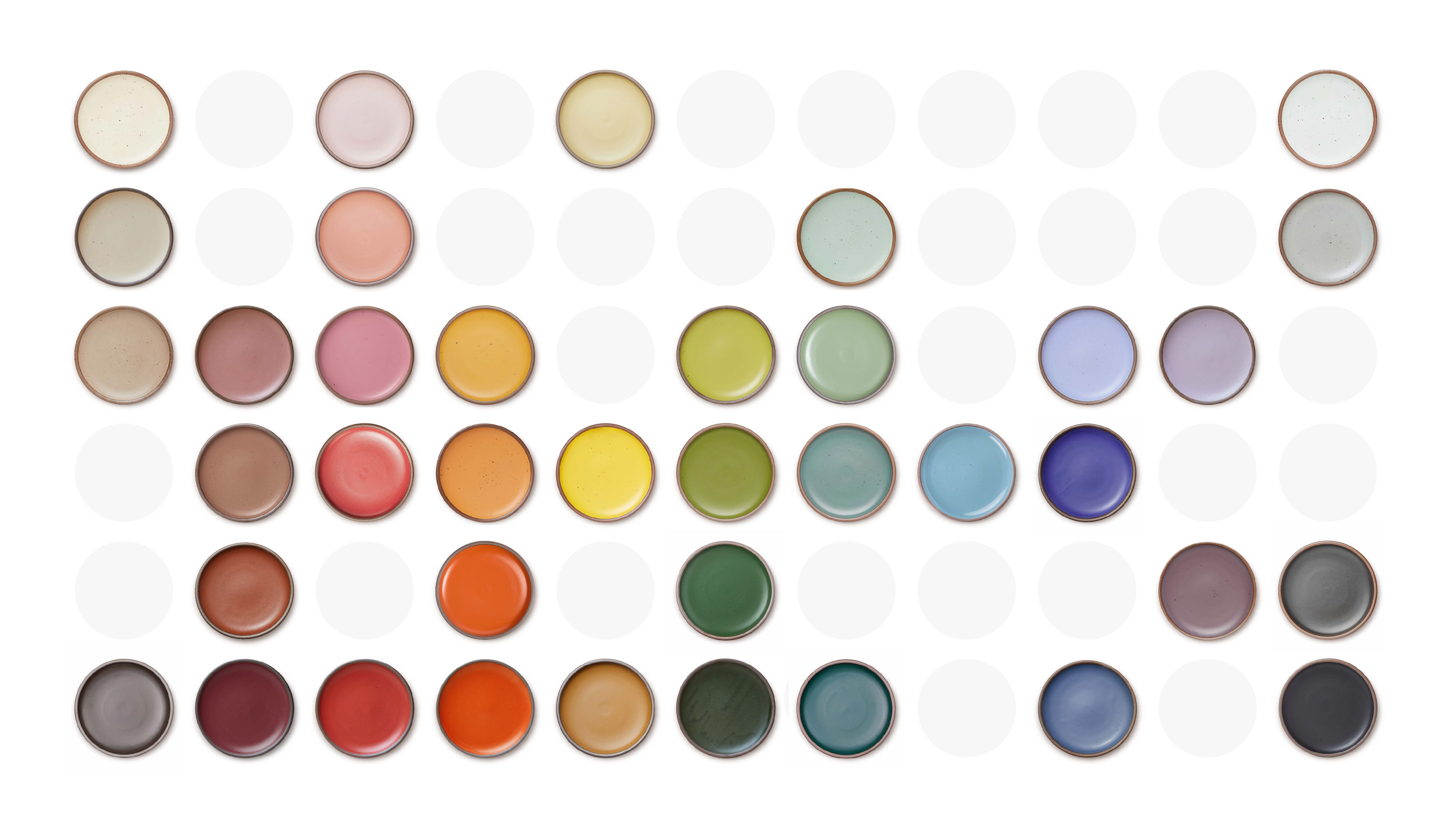
But back to your question. We’re getting to a point where we’ve developed a whole lot of colors! If we want to do a purple, for example, we may choose to do something new because we haven’t explored as extensively in the purple realm. But if it feels like time for a dark green, we may pull an idea from our archive because that’s more well-worn territory. Depends on the colors and the moment!
Can you share about the process in developing a new color? It’s a lot more involved than one might think!
Connie (our Co-Founder) either invited me in or I found a way to weasel my way into color planning years ago, who’s to say really, and we planned out all the way through Night Swim and Molasses together. She stepped away from East Fork in early 2023, and soon it was time to start planning our first season (this season!) without her guidance. We now have our colors planned out through this time next year, and each season we’re working a little further ahead.
After I do my color hunting out in the world, I put together a deck with notes on our color history (what’s missing, what customers are hungry for, etc.) and 1-2 seasonal directions to review with our product team. We talk about it, tweak it, then pass it off to Emma to start testing.
Emma (our Ceramic Engineering Associate) has an excellent color eye, a deep understanding of our materials, and a lot of perseverance. Some colors come easy and some are a battle. We have one coming out later in the year that she nailed on her 37th try! She’ll make initial tests, field all my picky requests, and test again.
Sometimes we land on a color only to learn all glazes need to be reformulated for one reason or another, and she’s back to testing. Sometimes the color is right but the surface quality is not, and testing continues. This process can take months. There’s so much more science and math involved that I can’t begin to speak to, but it’s a long process that requires a lot of expertise and patience.
Are you dreaming up any new colors for the core color palette?
I’m always dreaming about expanding our core. For the time being though, we’re sitting tight with our current core palette.
The hardest question of all, what is your favorite color so far? (We will be nice and give you 3!)
Night Swim and Harvest Moon are my all time favorites. And I think I might have a new favorite in Lamb’s Ear! Daylily doesn’t fit in quite as well with the colors I already have so I’ll probably just bring home my standard singles (The Mug, Bitty Bowls, and Cake Plates), but I’m obsessed with it as a standalone color.
And because I can’t follow the rules, my favorite cores are Morel, Black Mountain, and Amaro. Ok, I’m done, those are my top seven. Gah, I do love Fiddlehead too though!